One school.
Three perspectives.
School Management Parents · Teachers · Admins
Client
Simba Tech
Role
Lead UI Designer
Timeline
2 Months
Platform
Web UI Design
Overview
One school. Three perspectives.
Schools generate enormous amounts of information — grades, attendance, communication, events. But parents, teachers, and administrators all need completely different windows into that information.
I designed a three-role system where every user sees the same school data through an interface built specifically for how they interact with it.
3
User Roles
↑70%
Parent Engagement
Dashboard
First Design
View Design
Open in FigmaThe Challenge.
01
Parents were left out
Parents checked in on student progress infrequently because the existing tools were confusing and required multiple logins.
02
Teacher admin overload
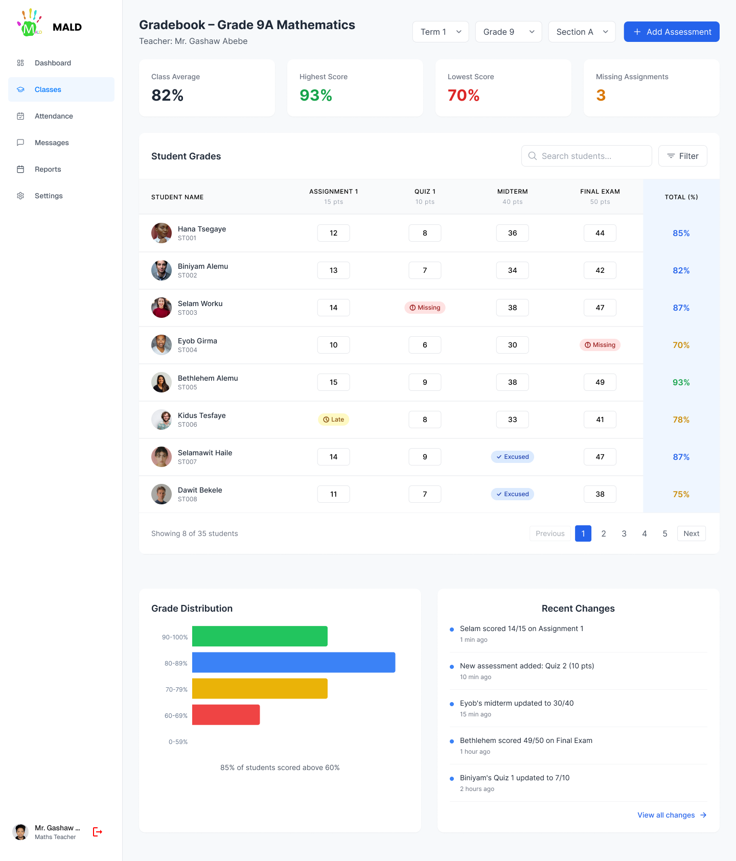
Teachers spent significant time on administrative tasks — grade entry, attendance, communication — in separate disconnected tools.
03
Admin visibility gap
School administrators had no real-time view of what was happening across classes, attendance, or communication.
Simba Tech — 2 MonthsWeb UI Design
Solution
The Solution.
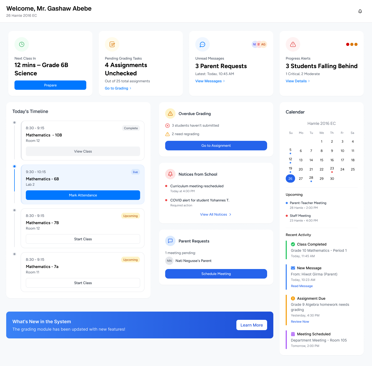
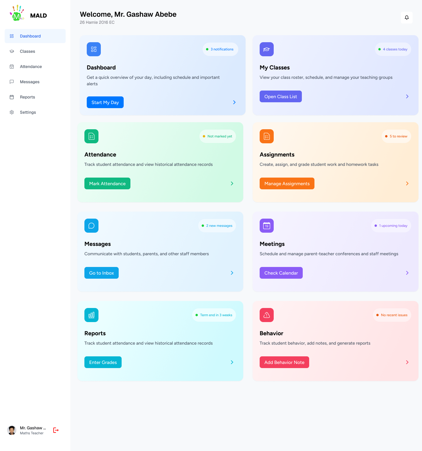
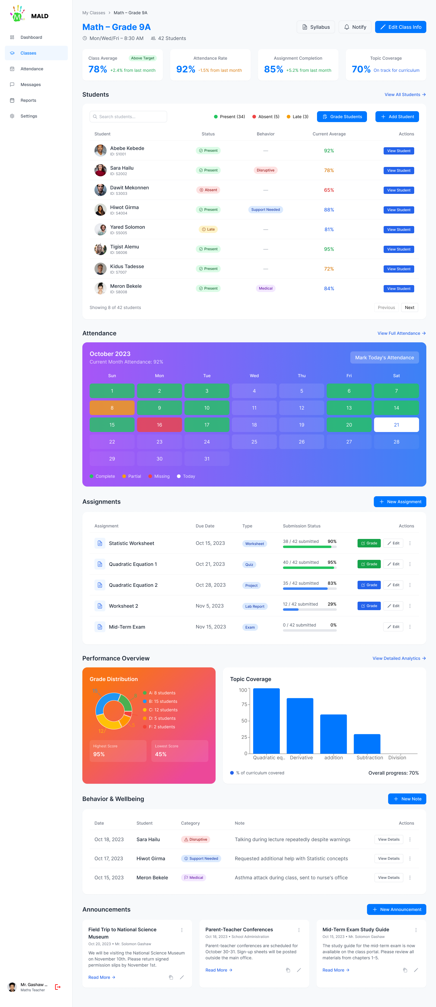
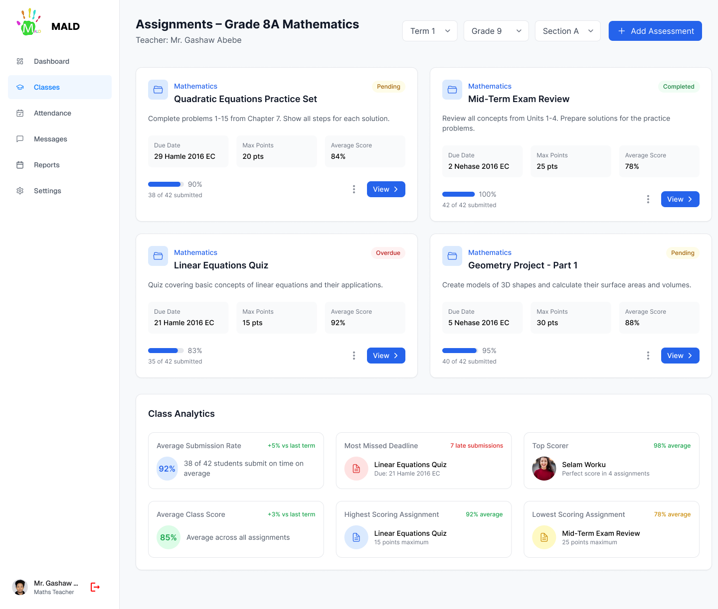
Role-specific dashboards that speak each user's language. Parents see a child-centric view — progress, attendance, messages. Teachers see their class and tasks. Admins see the whole school as a live dashboard.
What Was Built
→
Parent home: child progress, attendance, upcoming events
→
Teacher home: class roster, grade entry, quick messaging
→
Admin: school-wide analytics, alerts, staff management
→
Shared notification system with role-appropriate content
Screens & Visual Design
Design Gallery
Outcomes
The results.
↑70%
Parent Engagement
Parents checked the platform significantly more frequently with the redesigned interface.
↓50%
Admin Time on Reports
Automated dashboards halved the time admins spent compiling manual reports.
1
Unified System
All three roles — one coherent product. No more switching between tools.
Reflections
"Designing for parents reminded me that the most important users are often the ones who aren't tech savvy and who have the highest emotional stakes."
Key Learnings
01
Emotional stakes change designParents aren't using a tool — they're checking on their children. That emotional context changed every decision about tone, clarity, and notification design.
02
Role-based navigationThe same navigation structure serving three roles failed in testing. Fully role-specific navigation was harder to build but dramatically better to use.
03
Trust through transparencyParents engaged most with features that showed them exactly what was happening — not summaries, but direct windows into teacher communications.
Next Project
Harambee University E-Students Platform